
Shade Science · 5 min read
Reading undertone like a colourist: correction beyond the colour wheel
14 April 2026 · SUPERCOVER Artistry & Education
Green for red is where most training stops. A working guide to reading undertone on real clients, correcting deeper skin without grey casts, and keeping the base thin.
Every artist learns the colour wheel early. Green neutralises red, peach settles blue, lilac lifts sallowness. It is a useful starting point and a poor finishing one. On real faces, in real light, the rule of opposites gets you roughly in the right place and then leaves you with a grey jaw, a chalky under-eye or a base you have had to build three layers deep to hide your own correction. This piece is about the thinking that sits beyond the wheel.
Depth, undertone and surface colour are three different readings
Most mismatches come from collapsing three observations into one. Depth is how light or deep the skin is. Undertone is the steadier family of colour underneath: red, orange, gold, olive, yellow, neutral, or a mixture. Surface colour is everything sitting on top of that, including flushing, visible vessels, healing blemishes, pigmentation and the effects of sun. A client can be medium in depth, olive in undertone and visibly red across the cheeks all at once, and each of those needs a different response.
The error is matching foundation to surface colour. If you choose a pink-leaning base because the centre of the face looks pink, the redness gets reinforced and the rest of the face looks grey against it. Read undertone where surface colour is quietest: the side of the neck, behind the ear, the jaw where it turns under. Then treat the redness as a separate, local job.
Deep skin is not one warm undertone
Deeper complexions are where generic training fails most visibly. Deep skin can carry red, orange, gold, olive or neutral undertones, often in combination, and very often with different depths across the face: a deeper forehead and perimeter, a warmer or redder centre, a greyer or more uneven area around the mouth. Offering one deep warm shade flattens all of that and is the most common reason deep skin ends up looking ashy or orange in photographs.
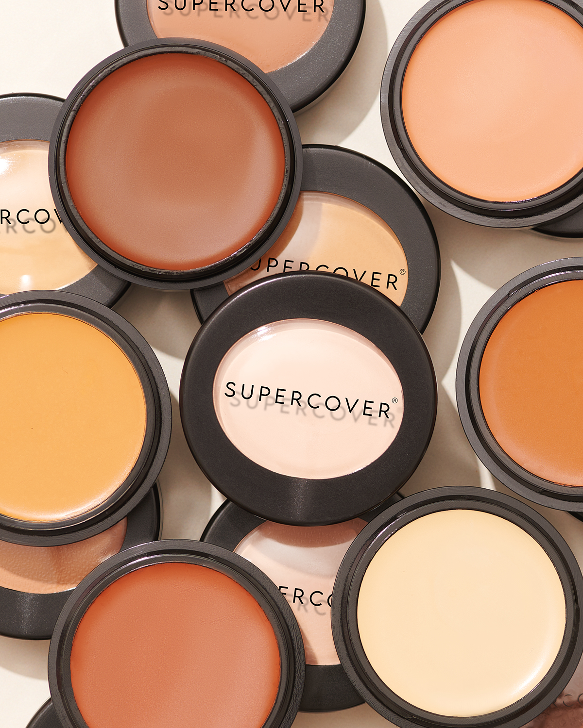
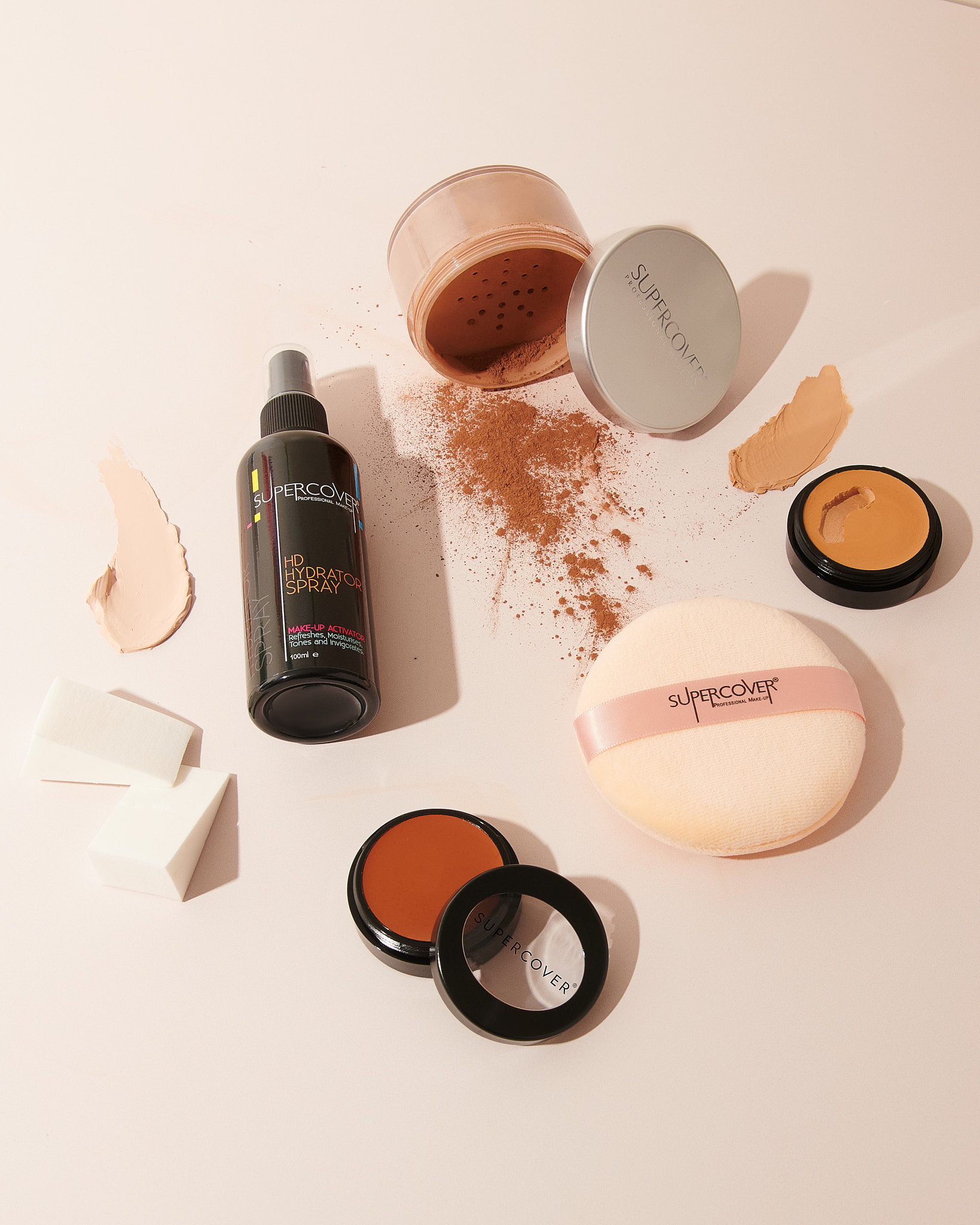
This is why the SUPERCOVER range is organised by undertone family, including Gold to Olive and Orange to Red, rather than by a single ladder of depth. It is also why shade numbers in the range are identifiers, not a light to dark scale. Use the family and depth band together to shortlist, and treat the number as a name.
- Match the perimeter and the centre separately if they differ by more than half a step, and blend the two where they meet.
- Where the mouth area reads grey or deeper, correct it locally rather than lifting the whole base lighter.
- Avoid lightening the centre of a deep face with a paler foundation. Brightness should come from placement and finish, not from a shade that does not belong to the skin.
Why cool correctors turn grey on deeper skin
A corrector is not a primary colour. It is a formulated colour designed to balance a specific discolouration on a specific depth of skin, under whatever goes over the top. Pure green or lilac, applied heavily on medium to deep skin, cancels the problem and takes the life out of the skin at the same time. The result reads as a grey or ashy patch that no amount of foundation will fully warm back up.
On deeper skin, warmer correctors in the orange to red family generally neutralise blue and grey tones, such as under-eye darkness or hyperpigmentation, far more naturally. On redness, a yellow-based neutraliser is often gentler than a straight green. Our No. 16, for example, is yellow based with green built into the pigment, precisely so it can quieten redness without the cast. Whatever you use, the principle is the same: choose the corrector for the skin as well as the problem.
“If you can see the corrector through the foundation, you used the wrong colour or too much of the right one.”
Placement and quantity do most of the work
- 01
Map before you touch the palette
Look at the bare face in good light and name the two or three areas that genuinely need balancing. Most faces need corrector in two or three places at most. Everything else is foundation's job.
- 02
Take less than you think
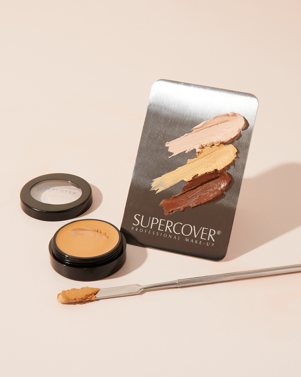
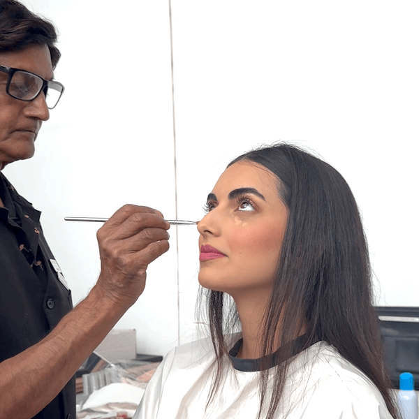
Lift a small amount onto the back of the hand or a palette to warm it, then press it on with a fingertip or small brush. A concentrated cream corrector covers in a thin layer, so a rice grain is usually enough for an under-eye.
- 03
Keep the edges soft, the centre full
Concentrate the corrector where the discolouration is strongest and fade it out to nothing at the edges. A hard edge of corrector becomes a hard edge of foundation later.
- 04
Press foundation over, never drag
Use a dampened sponge or brush and press. Dragging lifts the corrector and moves it where it was never meant to be, which is how a neat correction turns into a grey smudge.
- 05
Judge only once it has settled
Give cream formulas a few minutes before deciding whether you need more. Colour can read differently once the product has warmed and set into the skin.
Pigmentation, scarring and tattoos
Heavier correction jobs follow the same logic at a larger scale. With hyperpigmentation, correct only the darker patches, not the surrounding skin, so the overall depth of the face stays true. With raised or textured scarring, remember that colour can be corrected but texture cannot; keep product thin over the area so it does not catch light, and set lightly. With tattoos, work in thin layers, correcting the ink colour first, setting between layers, and building foundation on top gradually rather than in one heavy pass.
Checking your work
A good correction is invisible. Step back to conversational distance and look at the face as a whole. If one area draws the eye, whether because it is greyer, lighter or flatter than the rest, the correction is not finished. Ask the client to turn slowly towards and away from the light; texture and colour shifts show up on the move far more than they do head on. And if the finished base looks heavier than the skin you started with, go back to the map. There is almost always one layer that did not need to be there.
Shortlist a shade by undertone family
Shade Finder