Free UK delivery over £60
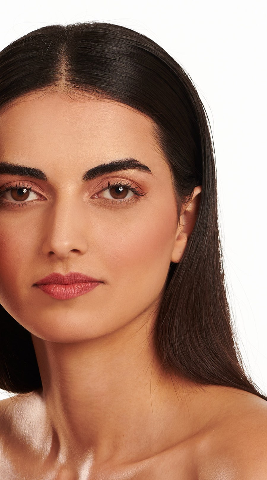
A SUPERCOVER base photographed close up in daylight

The SUPERCOVER method

The Art of Skin Fusion

Make-up that disappears into skin, from two artists who built a colour system around it.

Our point of view

Skin fusion is a way of working, not a finish

Colour first, coverage second. Correct the thing you can actually see, then match the skin around it, and keep the base as thin as the job allows. Everything we make follows that order.

01

Read before you cover

Most base problems are colour problems. Understanding what is happening in an area saves you three layers of foundation.

02

Undertone over depth

Depth gets you close. Undertone is what makes a shade look like it belongs to you rather than sitting on top of you.

03

Restraint is a technique

Pigment concentration does the work, so a small amount, placed well, outperforms a heavy layer every time.

Where this came from

Zaf and Najma, and a salon full of faces nobody was making shades for

SUPERCOVER began behind a chair, not behind a desk. Two years of blending and testing came out of a simple daily frustration: the ranges on the shelf were built as a light to dark ladder, and real complexions were not.

Zaf and Najma, the founders of SUPERCOVER

Najma opened a salon in South London and worked on real complexions all day. Zaf, a professional makeup artist, was on sets and shop floors where the same shades kept failing the same people. Between them they had the two halves of the problem: what a face needs, and what a cream has to do to deliver it.

The range that came out of it was grouped by undertone family, with correctors treated as a proper part of the base rather than an afterthought. That structure has not changed, because it still holds up in front of a mirror.

For years the products were mainly bought by professionals, passed between kits and taught in colleges. The move to selling directly is not a change of formula, it is simply opening the same kit to anyone who wants it.

We were never trying to cover people up. We were trying to find the colour that was already there, and let the makeup agree with it.
Zaf Ansari, co-founder

The formula

A cream that feels like silk and goes further than it should

Mineral cream, concentrated by design. The instruction has always been the same: use less than you think, warm it, and let the skin take it in.

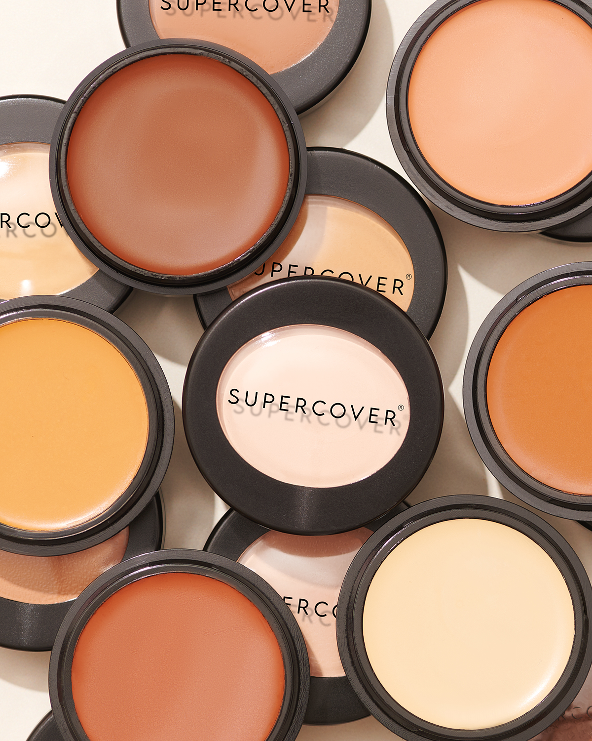
The cream foundation texture, close up

Most foundations get their coverage by being thick. Ours gets it from pigment, which means the same base can be pressed out to almost nothing or built to cover completely, without ever feeling heavy on the face.

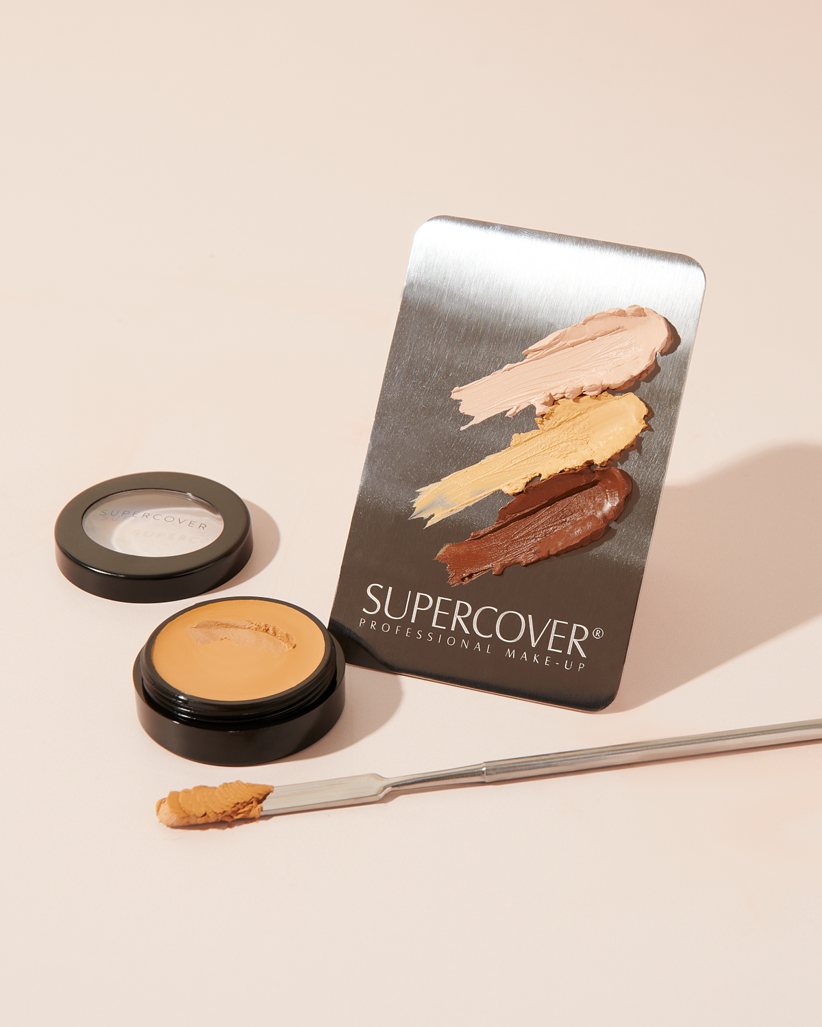
Lifted with the spatula and warmed on a steel palette or the back of the hand, the cream softens and spreads like silk. Pressed in with a dampened sponge, it settles into skin rather than sitting on it. That is what we mean by skin fusion: the base and the face stop reading as two separate things.

It is also why a single pot lasts. A professional kit carries it for months of bookings, and an everyday wearer rarely finishes one quickly.

Concentrated cream
A high pigment load, so a little goes a very long way. One pot lasts a working kit far longer than you expect.
Minerals and botanicals
Mineral describes what is in the base, not its texture. It arrives as a cream and moves like silk under a warm finger.
Non-comedogenic
Made to sit comfortably through long wear, which matters when the same client is in your chair every week.
41 shades by family
Grouped by undertone rather than stacked light to dark, so you choose the family first and the depth second.

One kit, every brief

From the editorial shoot to the bridal suite, and every quiet Tuesday in between

The same creams have to do very different jobs. Here is how the one formula is worked for each of them.

01

Editorial

Out there, and still skin

Graphic colour, high shine, a face built for a lens two inches away. The base has to be invisible under all of it, so the idea reads rather than the foundation.

How we work it

Thin, corrected, pressed with a damp sponge. Let the creative work sit on top of skin, not on top of a mask.

02

Bridal

Twelve hours, three kinds of light

Morning daylight, a church or registry office, flash on the dance floor. It has to survive tears, embraces and every photograph taken of it for decades after.

How we work it

Correct first, build only where needed, set by pressing. Hydrator Spray to melt the powder back into the cream.

03

Screen and stage

Studio lights, long days

The range was used on BBC productions including Casualty, where a base had to hold under hot lighting from first call to wrap, and still look like a person.

How we work it

Build with a brush on the areas cameras find first, powder generously, touch up by blotting rather than adding.

04

Everyday natural

The base nobody notices

Most of the time the brief is simply that the client looks rested and like themselves. That is the hardest brief there is, because there is nowhere to hide.

How we work it

A very small amount warmed on the back of the hand, pressed out over the centre of the face, nothing more.

Undertone

Depth tells you how light or deep. Undertone tells you which family

Our shades are grouped into families rather than lined up from light to dark. Choose the family that matches the quieter colour under your skin, then find the depth within it.

Ivory to Pink

Cool. Blue or pink veins, silver flatters, skin pinks up in the sun.

4 shades in this family

  • 32Light
  • 01Light
  • 03Light
  • 02Light

Screens shift colour, so treat these as a starting point. Test on the jaw and neck in daylight, and give the cream a few minutes to settle before you decide.

Reading skin

A face is rarely one colour, and the loudest area is rarely the truest

Before you choose anything, look at where the colour actually changes. Four areas tell you most of what you need.

A model photographed in even light, used to show where skin colour changes across the face and neck
Reference plateDaylight, no filter

Often the loudest area, rarely the truest

Flushing and vessels sitting close to the surface can make the cheeks read far pinker than the rest of the face. Useful to notice, not the place to decide an undertone.

Corrections

Ten things people get told that are not quite right

01

If the face looks pink, the undertone must be pink

Not necessarily. Cheeks, nose and the area around the mouth can show flushing, visible vessels, healing blemishes or irritation, and none of those is the quieter colour running underneath.

Read the neck and behind the ear in daylight as well as the face, then match to the area you want to harmonise rather than to the reddest part.

02

Deep skin is usually one warm undertone

Deep skin can be red, orange, gold, olive, yellow, neutral or a mixture. Our own range carries Gold to Olive and Orange to Red for exactly this reason.

A single deep warm label hides more than it explains, which is why the shade wall is grouped by family and not only by depth.

03

The vein test gives the answer

Veins are a clue, not a verdict. How they read is affected by skin depth, the colour around them and the light in the room.

The more useful question is which shade disappears into the skin in the light you actually live in.

04

One shade should be applied everywhere

A face often holds several colour zones. The forehead can be deeper from exposure, the centre warmer or redder, around the mouth greyer or uneven.

Correct locally, match to the area you want to settle, and keep the rest of the base thin.

05

Green is the universal answer to redness

Correction is relative to the colour you can see, the depth of the skin and whatever goes over the top. A cool corrector used heavily on deeper skin can leave a grey cast.

Our No. 16 is a yellow based neutraliser with the green built into the pigment, which is a reminder that a corrector is a formulated colour, not a primary colour rule.

06

Grey or ashy foundation means the wrong depth

It is just as often the undertone, too much corrector, too much powder, or a mismatch with the skin surrounding the area.

Test a thin stripe, let it settle, then compare in daylight before adding more product.

07

A higher shade number means a deeper shade

Shade numbers are identifiers, not a depth scale. Ours do not run in simple light to dark order.

Use the family and the depth band together, and treat the number as a name.

08

High coverage means a thick layer

Coverage comes from pigment concentration, placement, tool and pressure, not from thickness.

A concentrated cream can be spread thinly for every day and built only where you want more.

09

Mineral makeup means loose powder

Mineral describes what is in the formula, not the texture it arrives in. Ours is a cream with minerals and botanicals.

10

A phone photo can decide the final shade

A photo narrows the field. Exposure, white balance, screen settings and room light all move the result.

Use the shade finder to shortlist, then test on skin in daylight and give the formula time to settle.
Correction

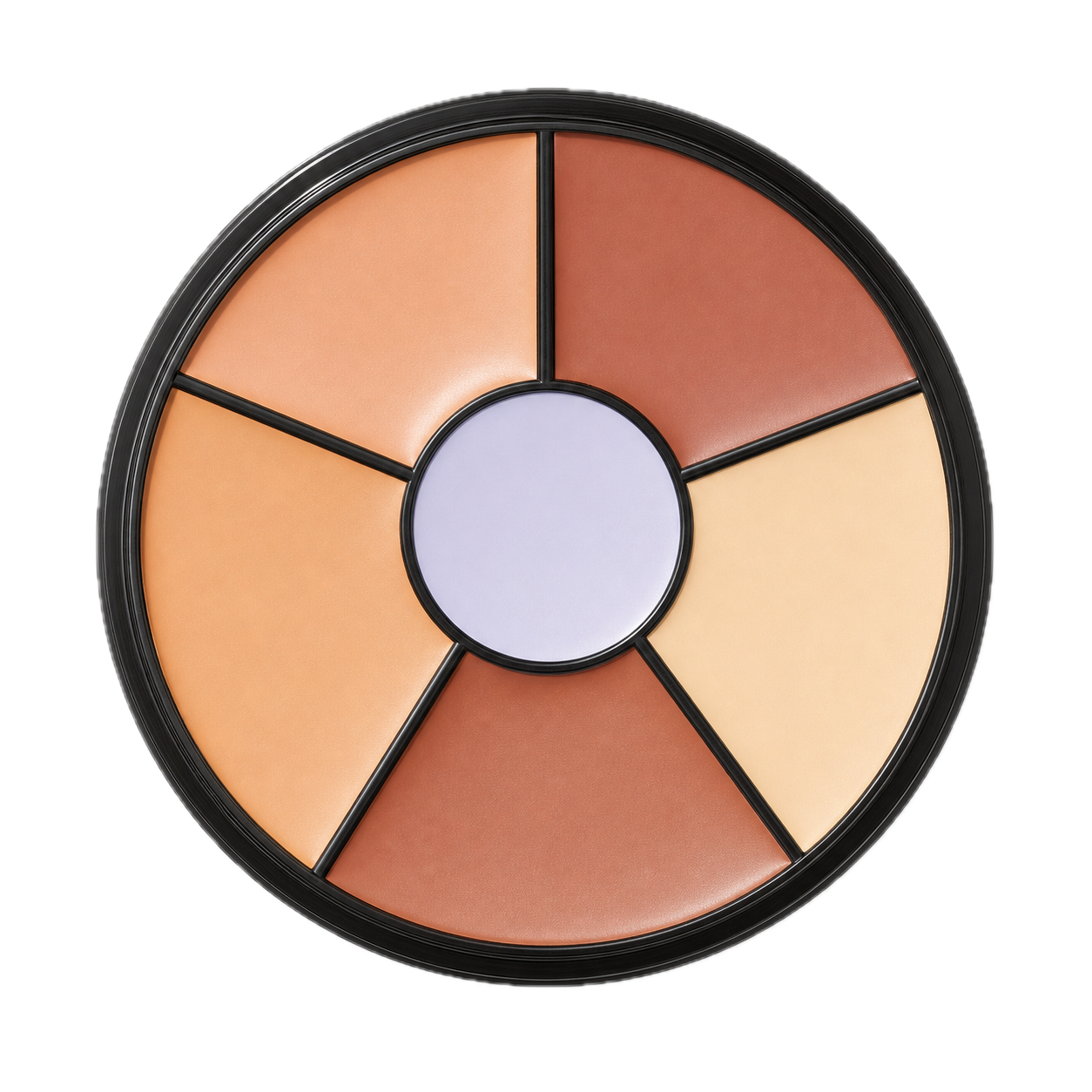
Six creams, and the reason your foundation can stay thin

A corrector settles one area so the base over it does not have to work twice as hard. Choose a colour to see what it is for and where it goes.

SUPERCOVER Corrector Wheel

No. 25

Blue Neutraliser

A warm corrector for blue and blue-brown areas such as under-eye shadow.

Under the eyes, around the mouth, anywhere cool-toned depth needs lifting.

  1. Identify
  2. Use a small amount
  3. Pat, do not drag
  4. Match over the top
  5. Set
Shop the corrector wheel

Method

Four steps, in this order

The order matters more than the products. Prep, correct, match and build, then set.

01

Prep

Start with clean, comfortable skin. Use what you normally use, then let it settle. Cream makeup needs something even to sit on.

02

Correct

Place corrector only where the colour needs balancing. Keep the amount small and the edges soft. Most faces need it in two or three places at most.

03

Match and build

Lift a small amount with the spatula, apply with a dampened sponge or brush, patting rather than dragging. Begin thin, build only where you want more.

04

Set

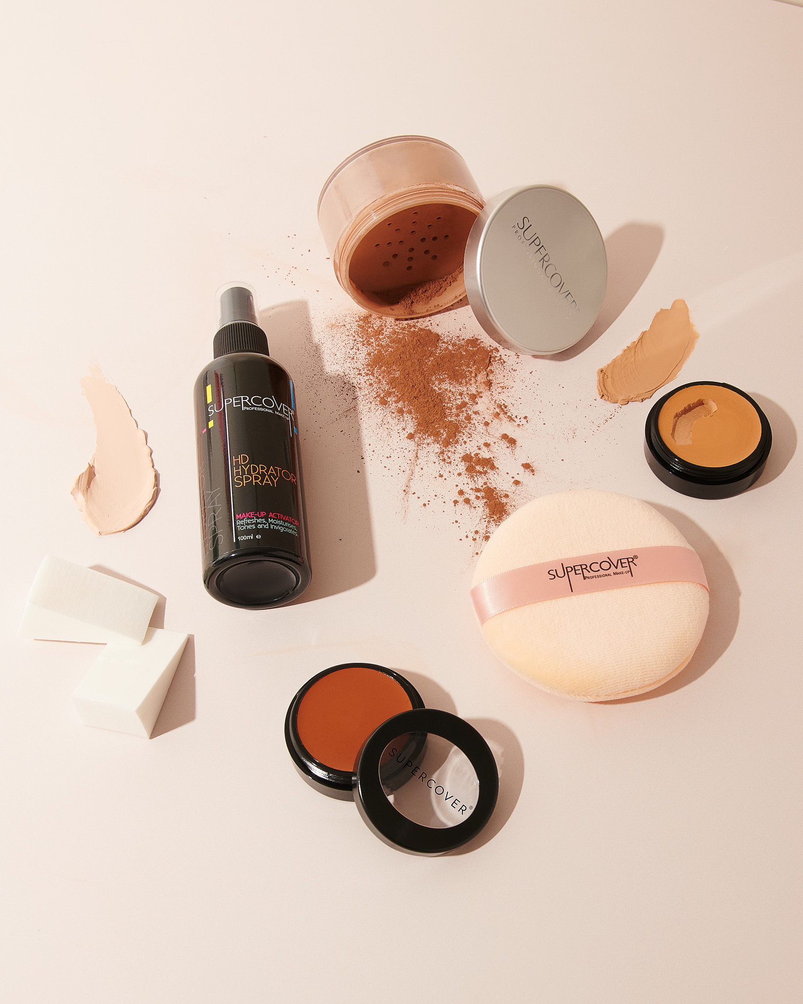
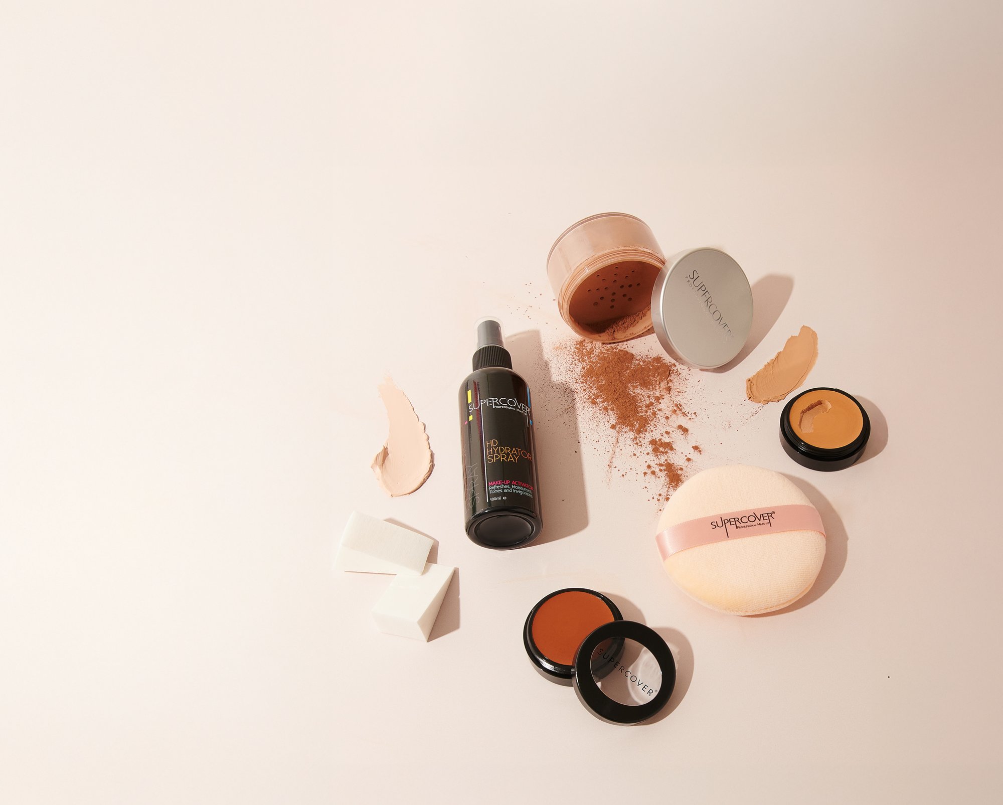
Set with a fine powder and a puff so the cream holds and transfers less. Finish with the Hydrator Spray if you want the surface to read softer.

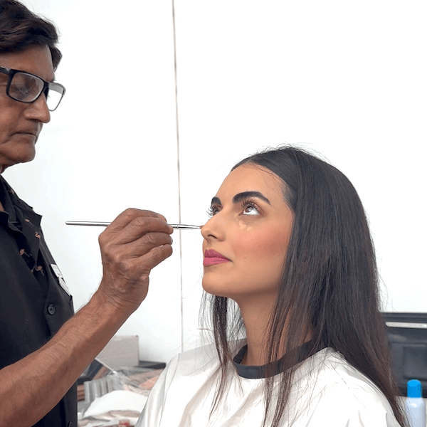
A make-up artist working SUPERCOVER cream foundation from a steel palette

Coverage is yours

Full coverage is an option, not an instruction

Some days you want a base nobody can see. Some days you want everything evened out. The same pot does both, and neither is the more serious choice.

Sheer

A very small amount pressed out with a damp sponge. Tone evened, texture left visible.

Everyday

Thin all over, built on the centre of the face and anywhere you want settled.

Full

Correct first, then build in layers with a brush. Set properly so it stays where you put it.

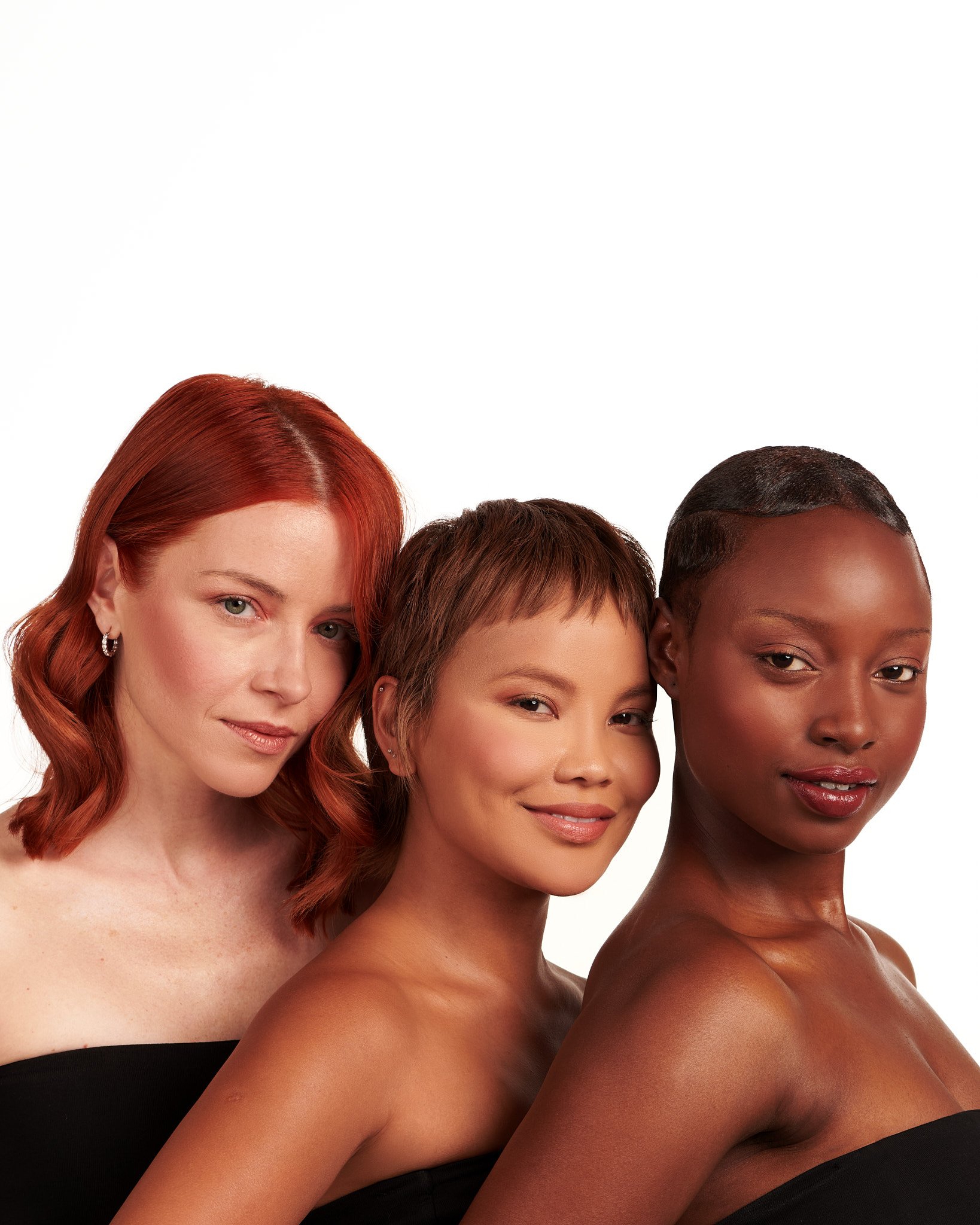
Three models with fair, medium and deep complexions, each wearing a SUPERCOVER base

Questions

The questions artists ask us most

Answered the way we would answer them across a make-up table.

A make-up artist building a strong blush on a model
Colour placed, base kept thin
01How should undertone be distinguished from surface colour when reading a client's skin?

Surface colour is transient: flushing, vascularity, healing marks, sun exposure. Undertone is the constant beneath it. Read the neck and the area behind the ear in daylight, where the skin is least reactive, then treat the centre of the face as information to correct rather than the target to match.

02Why does deep skin so often turn ashy under a base, and how is it prevented?

Ashiness is almost always a loss of warmth: a shade from the wrong family, a cool corrector laid on too heavily, or excess powder sitting on the surface. Deep complexions carry red, orange, gold and olive in varying measure, which is why the range holds Gold to Olive and Orange to Red families. Choose the family first, correct in small amounts, and press powder rather than sweeping it.

03Where should a professional corrector sit in the sequence, and how much is enough?

After prep and before foundation, placed only where the colour needs neutralising, usually two or three areas at most. The purpose is to let the foundation stay thin. If you are building layers of base to hide something, a small amount of the right corrector would almost certainly have done it.

04Should a shade be matched to the face, the jaw or the neck?

Swatch along the jaw and judge it against the neck, so the face never reads as a separate plane in photographs. Match to the area you want to harmonise, not the reddest part of the face.

05How does lighting change the way a shade should be judged?

Daylight is the reference. Warm interior bulbs flatter and hide mismatches, cool office light exaggerates grey, and camera flash reveals anything sitting on rather than in the skin. Test thin stripes, let the cream settle for a few minutes, then judge by a window. The shade that disappears is the shade.

06How can one cream foundation work for sheer, everyday and full coverage looks?

Because coverage comes from pigment concentration and placement, not thickness. Pressed out with a dampened sponge, a small amount evens tone and leaves texture visible. Built with a brush on corrected areas and set properly, the same pot gives full, camera ready coverage.

07What does mineral cream foundation actually mean?

Minerals and botanicals held in a concentrated cream base. Mineral describes what is in the formula, not the texture it arrives in, which is why it behaves nothing like a loose powder.

08Why do SUPERCOVER shade numbers not run from light to dark?

They are identifiers carried over from the professional range, not a depth scale. Read the undertone family and the depth band together, and treat the number as a name.

09How should a cream base be set for long wear on set or at a wedding?

Press a fine setting powder in with a puff rather than dusting it across, concentrating on the centre of the face and anywhere that moves. A mist of Hydrator Spray afterwards melts the powder back into the cream so the surface reads as skin rather than make-up.

Finding yours

Two ways to land on the right shade

One takes a minute on your own. The other puts it in front of us.

On your own, one minute

Shade finder

Answer a few questions about depth and undertone and we will shortlist the shades worth testing. Or take three home in the trial kit and decide on your own skin.

With an artist

Let us match you properly

Send photographs in daylight, tell us what you have worn before and what did not work, and one of us will read it and come back to you. No automated answer.

Request a consultation